

CDC Visual Identity Refresh
Impact Strip
- Led end-to-end as Creative Director — strategy, system design, stakeholder alignment, and enterprise rollout
- 12+ centers aligned under a unified visual system
- 10,000+ staff supported with scalable brand tools
- 95% brand adoption across the organization
- 40% reduction in off-brand usage
- Rapid adoption across 20+ divisions within the first month
Details below
Challenge
CDC’s visual identity had become inconsistent across its 12+ centers, with pandemic-era urgency accelerating fragmentation. Logos were misused, templates were outdated, and communications lacked cohesion at a time when clarity and trust were critical.
The objective was not a rebrand, but a system-level modernization—restoring consistency, improving accessibility, and enabling scalable adoption across the enterprise.
Strategy & Process
I began with a comprehensive audit across web, print, social, and presentation assets — mapping the full scope of fragmentation before making any creative decisions. External benchmarking across healthcare, education, government, and technology informed the modernization direction.
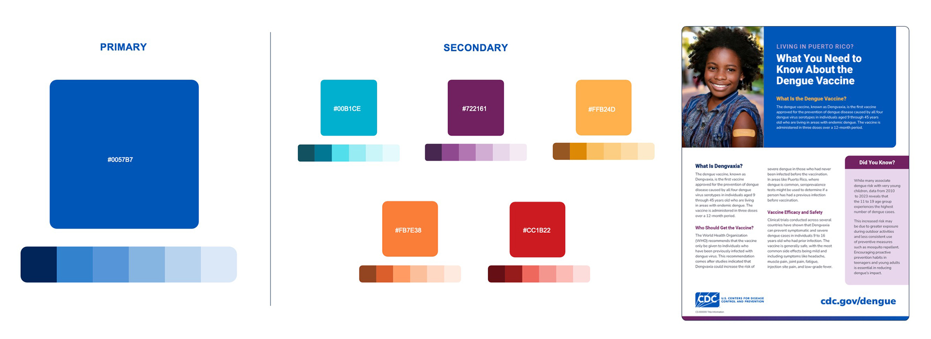
I made a deliberate choice to build for endurance over trend — refining typography, color, and layout foundations that could flex across 20+ divisions without breaking. Accessibility validation and senior stakeholder alignment were built into the process from the start, not retrofitted at the end.
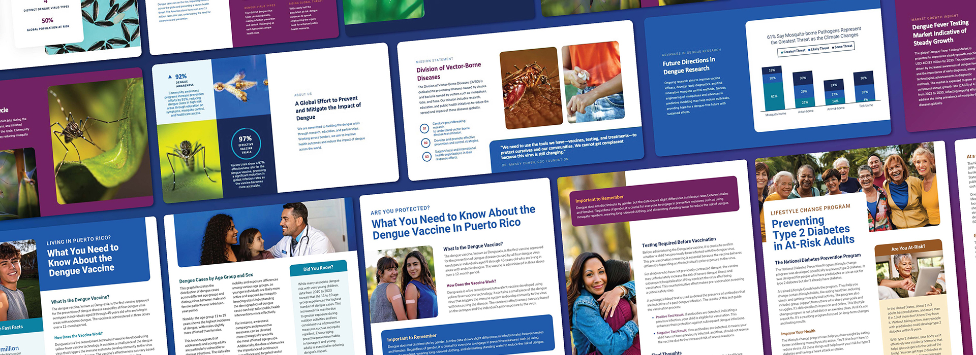
From there I led the development of a scalable template ecosystem across Adobe Express, reports, fact sheets, social, and presentations — designed to work for both designers and non-design staff, so adoption didn't depend on creative gatekeeping.
The final phase was rebuilding the CDC Brand Hub — overhauling information architecture, governance documentation, and asset access so the system could sustain itself after launch.
Impact
The refreshed system launched to more than 10,000 staff and quickly became CDC’s central design foundation. Within the first month, hundreds of templates were adopted across more than 20 divisions, including emergency response teams and national campaigns.
The introduction of Adobe Express templates significantly increased speed and accessibility, enabling teams to create branded assets more efficiently while maintaining consistency.
The result was improved operational efficiency and strengthened visual trust during a critical period for public health communication.
My Role
As Creative Director, I co-led the initiative, shaping the visual system, aligning stakeholders across centers, and guiding both creative direction and rollout strategy to ensure adoption at scale.
